Automata Brand Kit
Visual resources to represent Automata
Guidelines
Our brand kit ensures consistency and clarity. Follow these guidelines for the proper use of our logo, colors, and design elements to maintain Automata Network's identity across all platforms.
Download AssetsLogotype
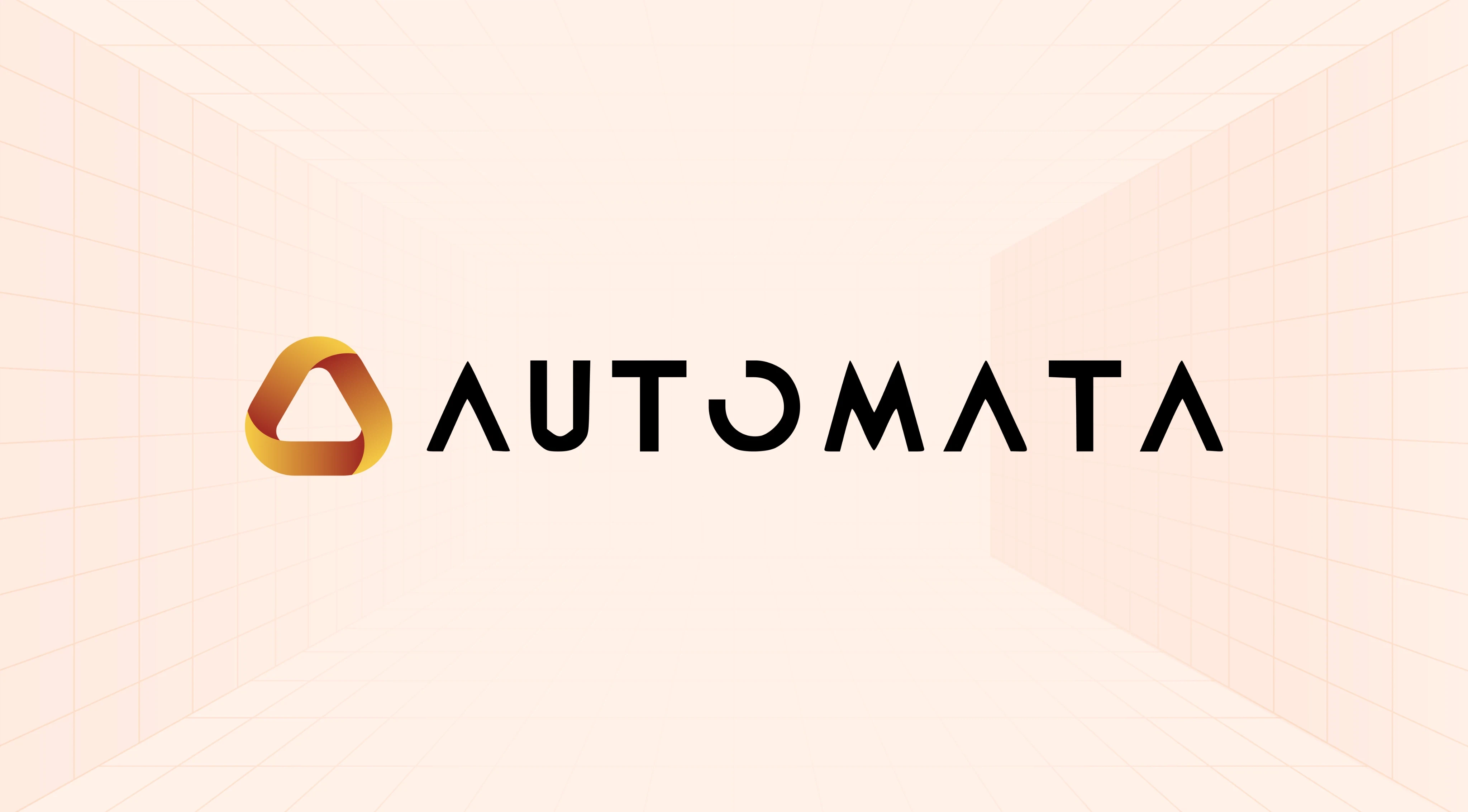
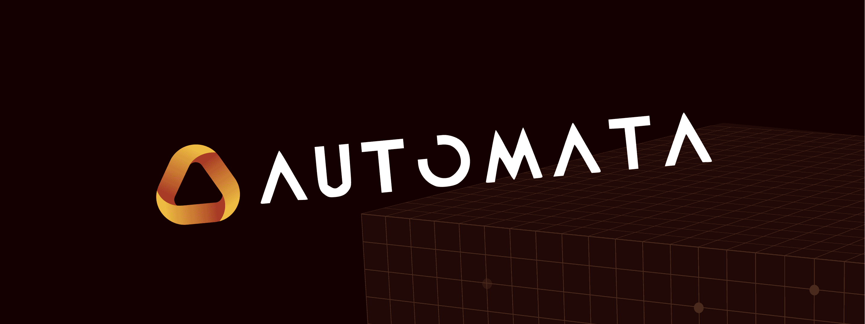
The Möbius strip represents the nature of trust in Automata Network, a machine attestation layer that integrates TEEs into decentralized and AI systems. Like the Möbius strip—a surface with only one side and one boundary - Automata ensures an unbroken chain of attestation, where machines, computation, and verification exist in a unified, continuous loop.
When using the logotype, be sure to give it some white space for breathing purposes. As a rule of thumb, use a 66% sized icon to measure the space surrounding it.
Logotype Do's

Use simple and unobtrusive background elements when creating lock-ups.

Use appropriate color contrasts to ensure logos stand out individually.

Ensure that the logo or icon is cohesive with the rest of the composition.
Logotype Dont's
Do not stretch or distort the logotype in any way.
Avoid using the logotype in colors that are not part of the brand color palette.

Do not add any additional elements (e.g., drop shadows) to the logotype.
Never rotate the logotype from its original orientation.
Do not reverse or alter the elements on the logotype.
Logo
When using the icon, utilize a 50% sized version of it as a spacing guide. Make sure there's an appropriate amount of white space to maintain the intended visual structure.
Logo Do's
Use simple and unobtrusive background elements when creating lock-ups.
Use appropriate color contrasts to ensure logos stand out individually.
Ensure that the logo or icon is cohesive with the rest of the composition.
Logo Dont's
Use the logo in its proper proportions without scaling it disproportionately.
Avoid using the logotype in colors that are not part of the brand color palette.
Do not add shadows, outlines, or effects that change the logo's original design.
Do not rotate or flip the logo at any angle.
Brand Colors
Color application will differ based on media and execution. Prioritize the legibility of the message when it comes to color pairings.
Brand Pairing: Partnership Lock-ups
Pair logos with shared spacing to maintain clean lines and integrity. For digital presentations, ensure logos are high resolution.


Brand Pairing Do's & Don'ts

When pairing Automata with other company logos, utilize the logo instead of the full logotype.

When pairing Automata with other company logotypes, utilize the logotype instead of the icon.

Do not place the Automata logo with another brand's full logotype. Visual balance is important.